

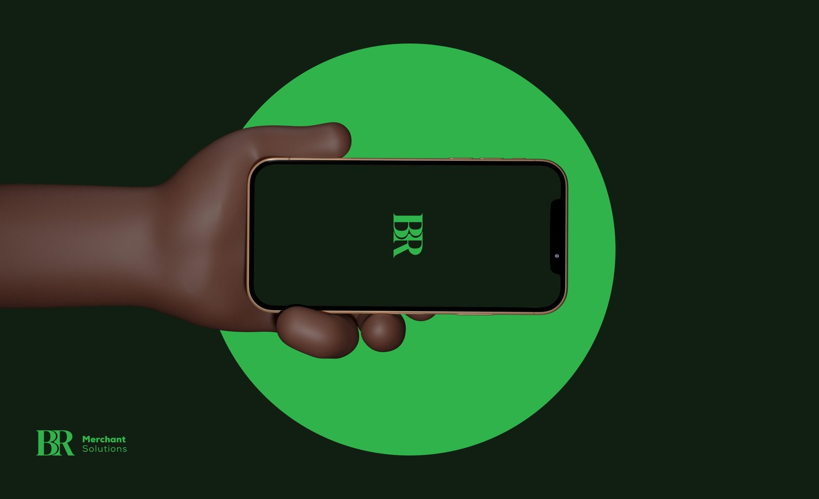
( Overview ) BR Merchants entered the credit card processing space with no visual language - nothing signaling credibility in a category where trust is the product. The brief: build an identity from zero that reads as established, secure, and competent from first impression.
Sole Designer. Two months. Logo, color system, style guide, business cards, and website.
( Approach )
Fintech and payments reward restraint over cleverness - a competitor audit confirmed the pattern: heavy reliance on blue, geometric marks, conservative type. Rather than fight category convention, I leaned into it deliberately, differentiating through execution precision rather than novelty.
-
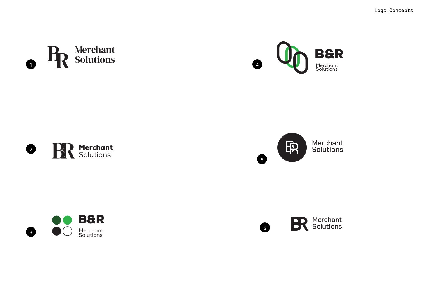
The logo went through several structural directions before landing on a mark that balances authority and approachability
-
Avoiding both the cold-corporate and overly soft extremes common in the category
-
The color system draws on trust cues - blue, neutral grounding tones - tuned for contrast and accessibility, not decoration
-
Every color choice is justified by where it lives: card, screen, or print
-
The style guide was written as a working tool, not an archive piece - usage rules, spacing logic, and type hierarchy so the identity holds beyond the first rollout

( System )
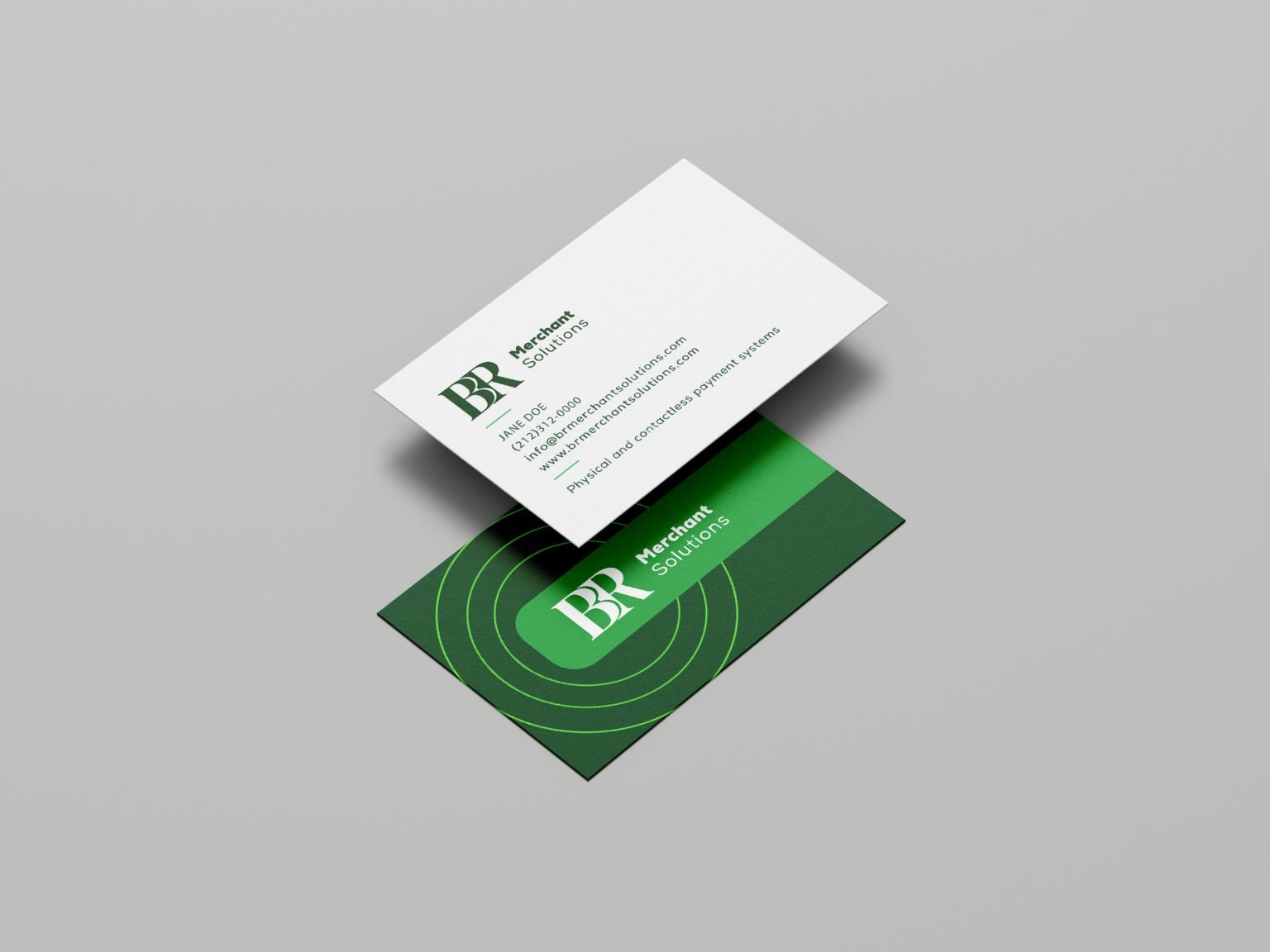
Business cards and the website were treated as proof points for the system, not separate exercises - same logic, same restraint, same hierarchy carried through both.
-
( 001 )A working style guide, so future collateral can follow the same rules