

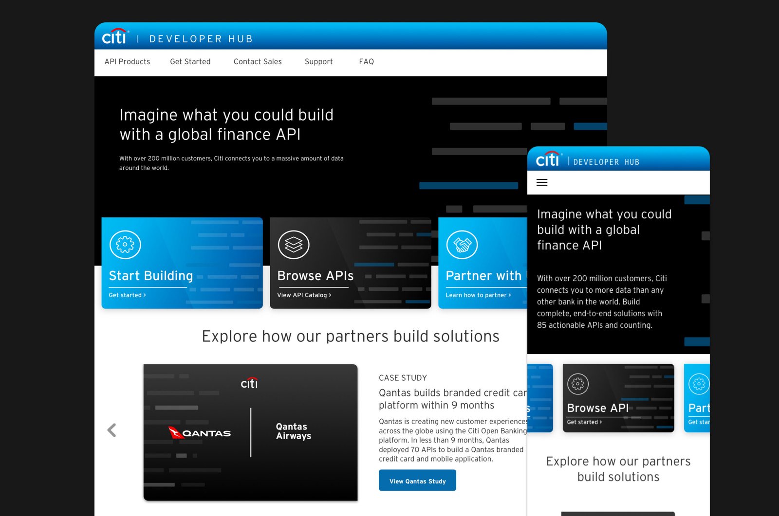
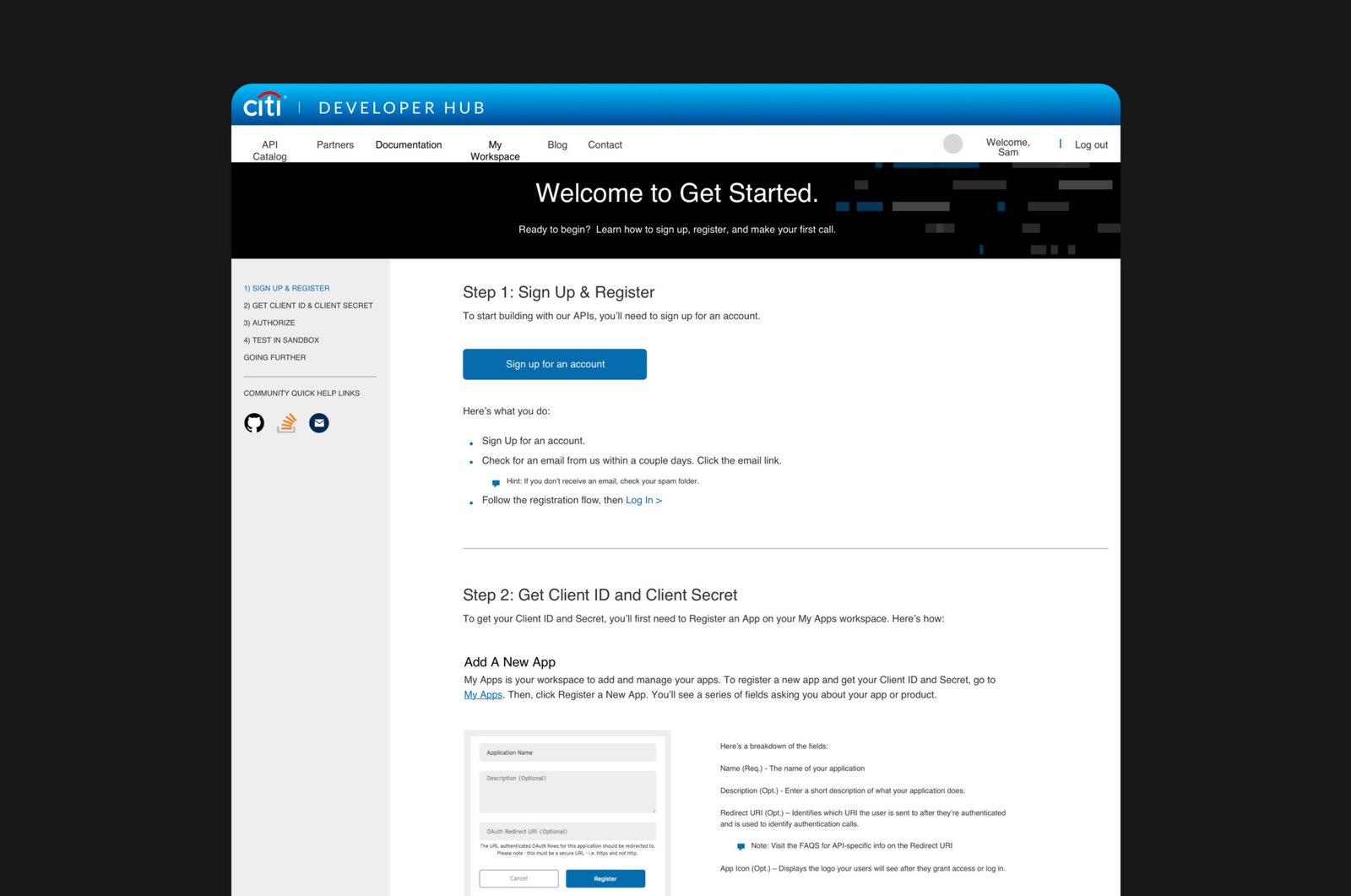
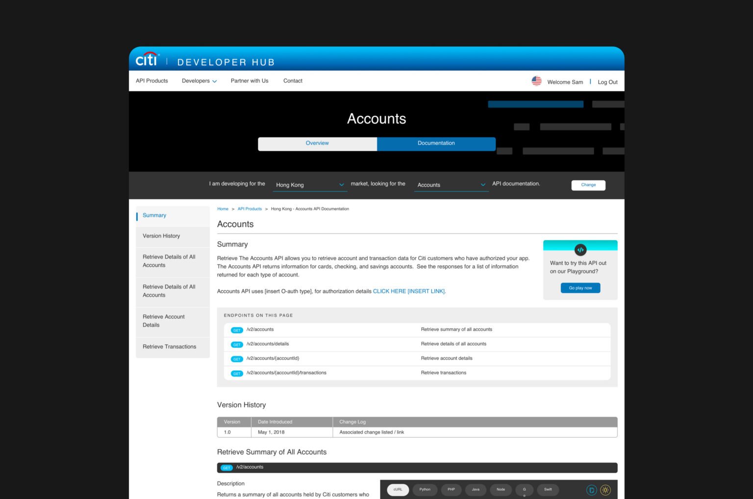
Citi's Developer Hub is a global API portal, launched in 2016, that lets external developers discover, test, and build against Citi's banking APIs. I led the 2017 redesign as the senior product designer — owning the user research, the design system rebuild, and the end-to-end experience, working with a Creative Director, Project Manager, UX Designer, Copy Writer, and Product Owner, then handing off to a team of 10 engineers.
Role — Senior Product Designer, UX & Design System Lead. Timeline — Redesigned December 2017. Team — Creative Director, Project Manager, UX Designer, Copy Writer, Product Owner, 10 engineers, QA, prototyper, and research facilitator.
( Design Challenge )
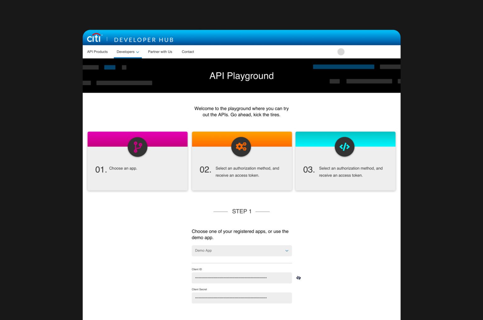
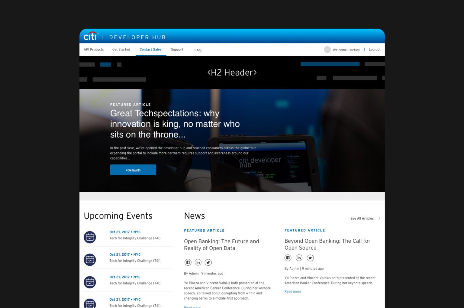
The original Dev Hub was built to meet basic business requirements. It had no user-centric design, no educational on-ramp for people evaluating Citi's APIs, and no reusable design system, so every new page was built from scratch. Going in, I set four goals for the redesign:
-
01
Define the actual user personas the site needed to serve
-
02
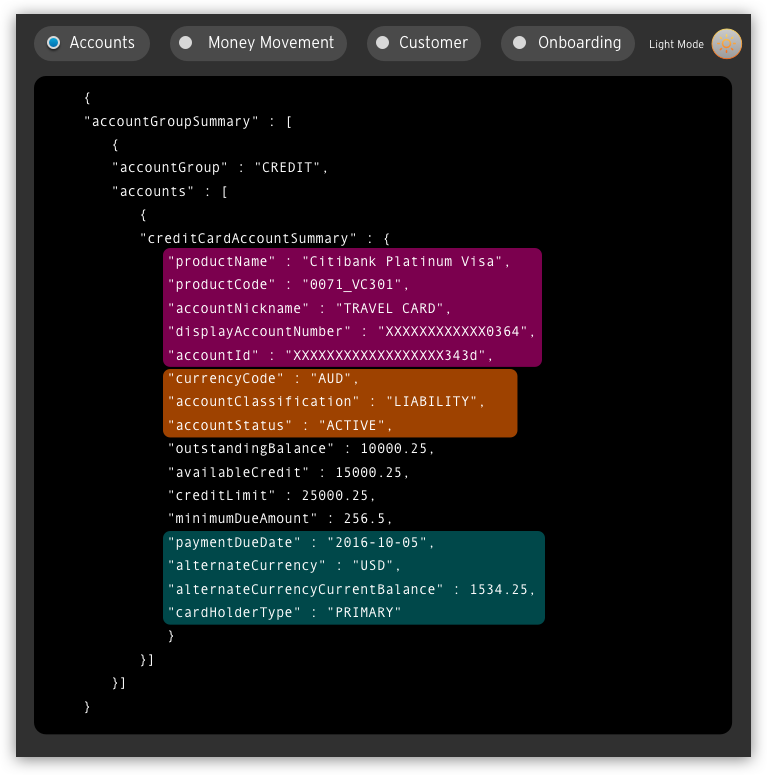
Educate visitors on Citi’s API offerings, not just list them
-
03
Refine the core experience end to end
-
04
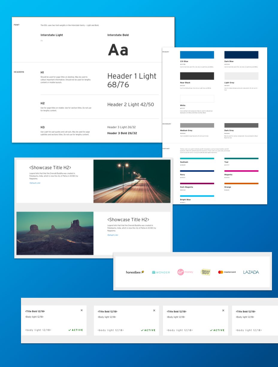
Establish a real design system engineering could build on
( Research )
I grounded the redesign in heatmaps, web analytics, and support tickets, then structured three coherent paths for the site: Developer, Product Manager, and Business Lead.
-
01
Heatmaps & analytics
Where users struggled
-
02
Support tickets
Product priorities from real friction
-
03
User personas
- Developer
- Product Manager
- Business Lead
-
04
Information architecture
Three coherent paths, one per persona
-
05
How might we
Ease of use, education, and hierarchy
( Defining the Problem )
Working with engineering partners, I framed the redesign around How Might We questions on ease of use, education, and information hierarchy.
-
01
How might we tell a story? Lean on Citi’s history and the scale of data the company generates.
-
02
How might we route users through the site? Surface numeric data, spotlight popular APIs, and show product flexibility.
-
03
How might we differentiate and show value? Signal brand reach, spotlight popular APIs, and show partner-tailored experiences.
-
04
How might we meet users at different points? Anticipate informational structure, show technical areas in use, and use animated explainers.
( Outcome )
The year after launch, registration completion rose from 35% to 92%. The system also extended to Blog, Getting Started, and API Documentation, which showed it could ship beyond the homepage. Measured from December 2017 to November 2018. The redesign won two 2018 W3 Awards (Silver), for Home Page Design and UX.
-
1.320+ new external developer registrations
-
2.20,600+ valid API calls through the portal
-
3.92% registration completion, up from 35%