Developer Hub
Project Brief
In 2016, Citi Bank launched a global API developer portal. Allowing developers to rapidly build applications leveraging the various API’s. The main objective of this redesign was a user-centric experience focused on providing particular user groups with the information necessary to learn more about the offering and overall capabilities of the API’s
Citi has teamed up with several leading companies, including Mastercard, Virgin Money, and Wonder. Earlier this year in the U.S., Citi’s Pay with Points API started providing Citi ThankYou® Rewards members with an eligible Citi credit card the option to use points to cover all or part of their purchases with a statement credit when using their card to make purchases on BestBuy.com and in the Wonder App.
Design Challenge
The original website was built to meet basic business requirements and lacked a user-centric design and educational approach. It also featured a limited number of reusable design system components.
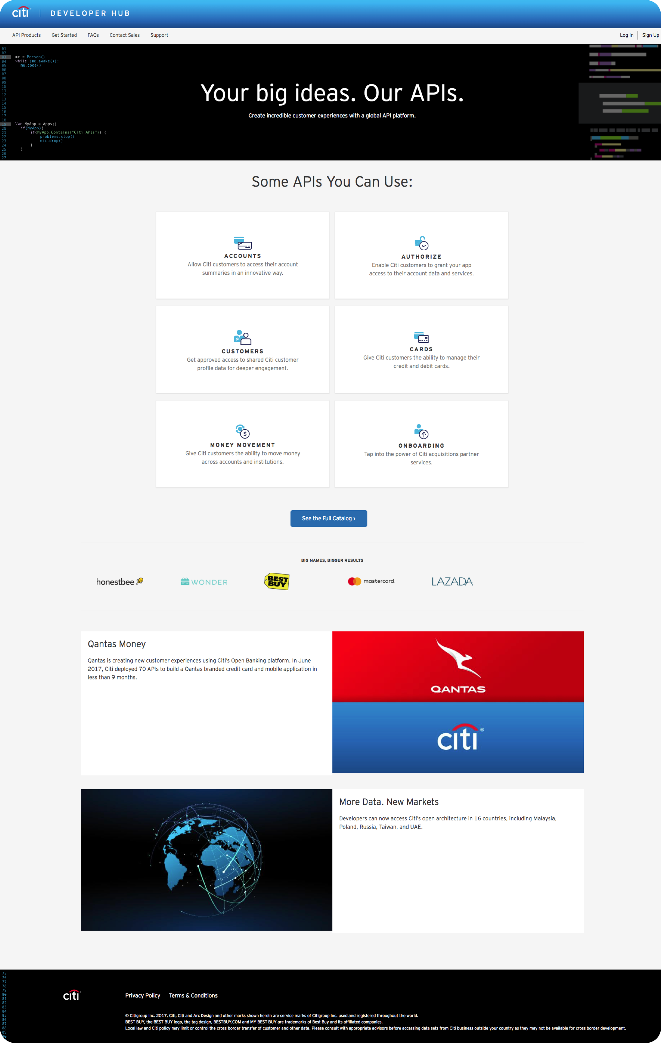
Previous homepage design 2016*
Project Goals
Take advantage of the experiential-learning opportunities built into many programs. You can work in labs on and off
REFINE USER
EXPERIENCE
EDUCATE VISITORS ON API OFFERINGS
CREATE/DEFINE USER PERSONAS
ESTABLISH A DESIGN SYSTEM
User Research
Evaluated The Current Experience
The initial step was an audit of the current experience. We reviewed click heat maps, web analytics and support tickets. These helped us make informed product and design decisions.
CLICK HEAT MAPS
WEBSITE ANALYTICS
SUPPORT TICKETS
Persona Development
Established User Personas
Based on the data collected and reviewed we took a further look into the types of users visiting the site. This gave us a better understanding on how to structure the information and overall experience.
Building products using the API and reviewing documentation.
Understand the API offerings and how they reacted to product needs.
Focused on use cases and data to make informed product decisions.
Design Process
Wire framing & Validation
Our learnings from the previous steps and combined them into a homepage wire that featured paths for each user group while also fulfilling business goals and requirements.
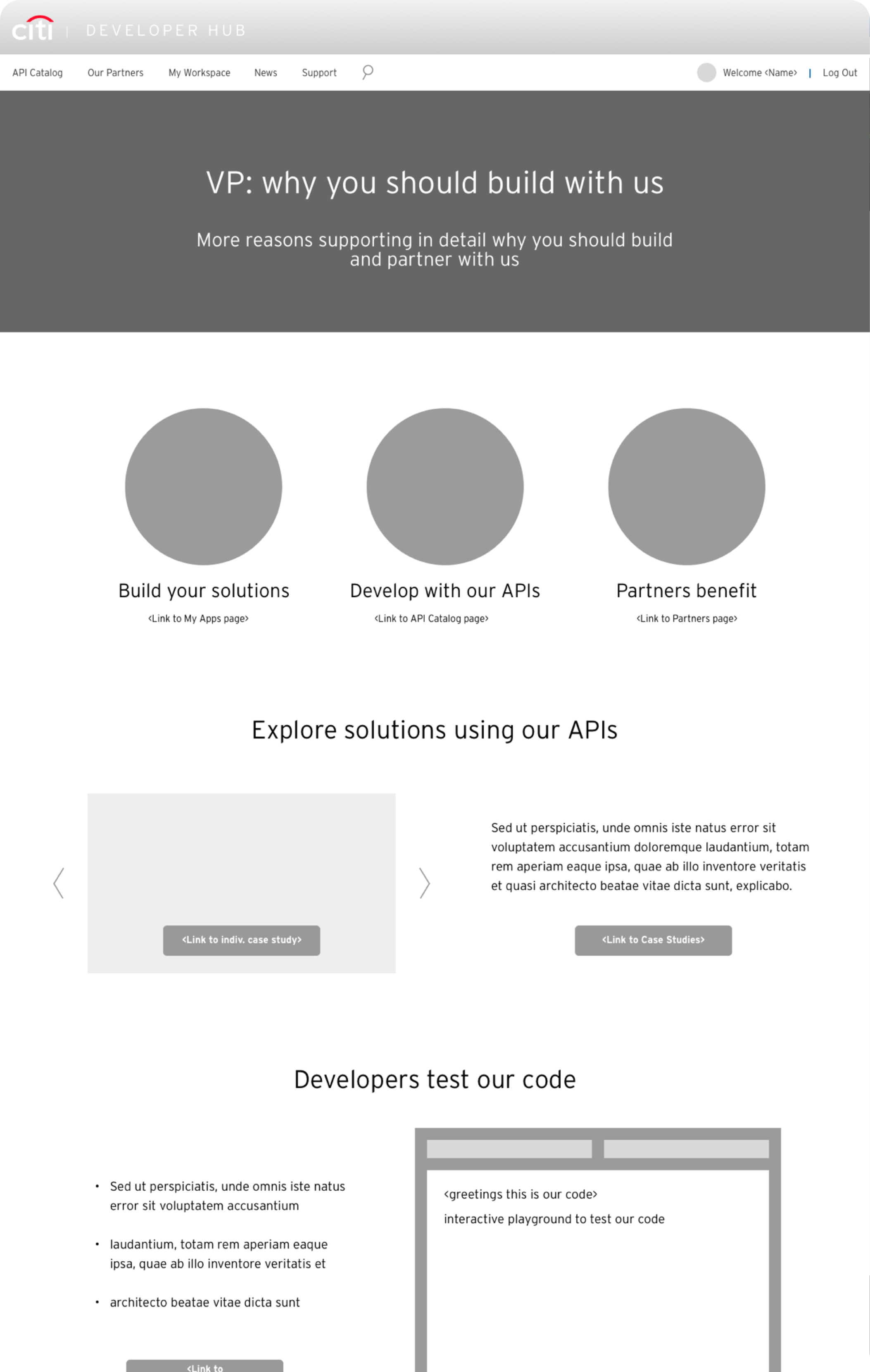
Design Process
Design System Audit
After reviewing the existing design system, I discovered the following items needed to be addressed:
- Type Ramp
- Brand Colors
- Grid System
- Spacing Rules
- Icon Set
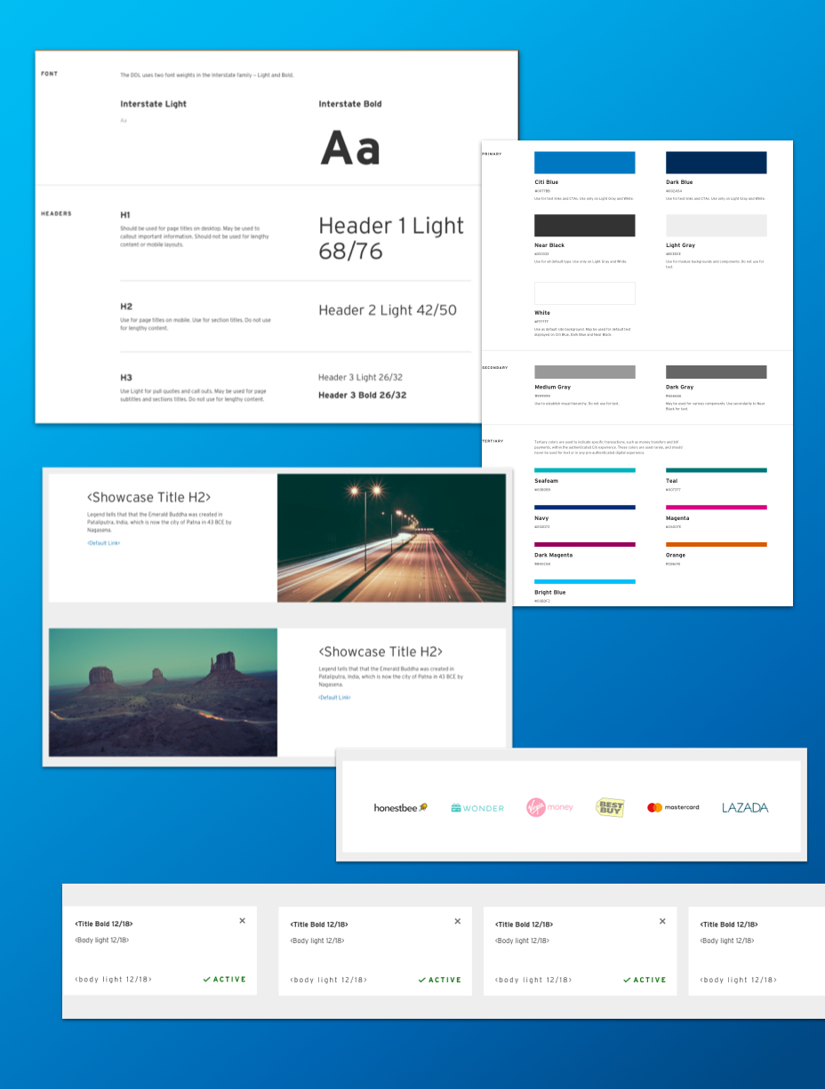
Design Process
Engineering Requirements
- Drupal CMS Integration
- Breakpoints & Grid System
- Typography Scaling
- Color Variables
- Animations
- Hand Off Process
Design Process
The Design System
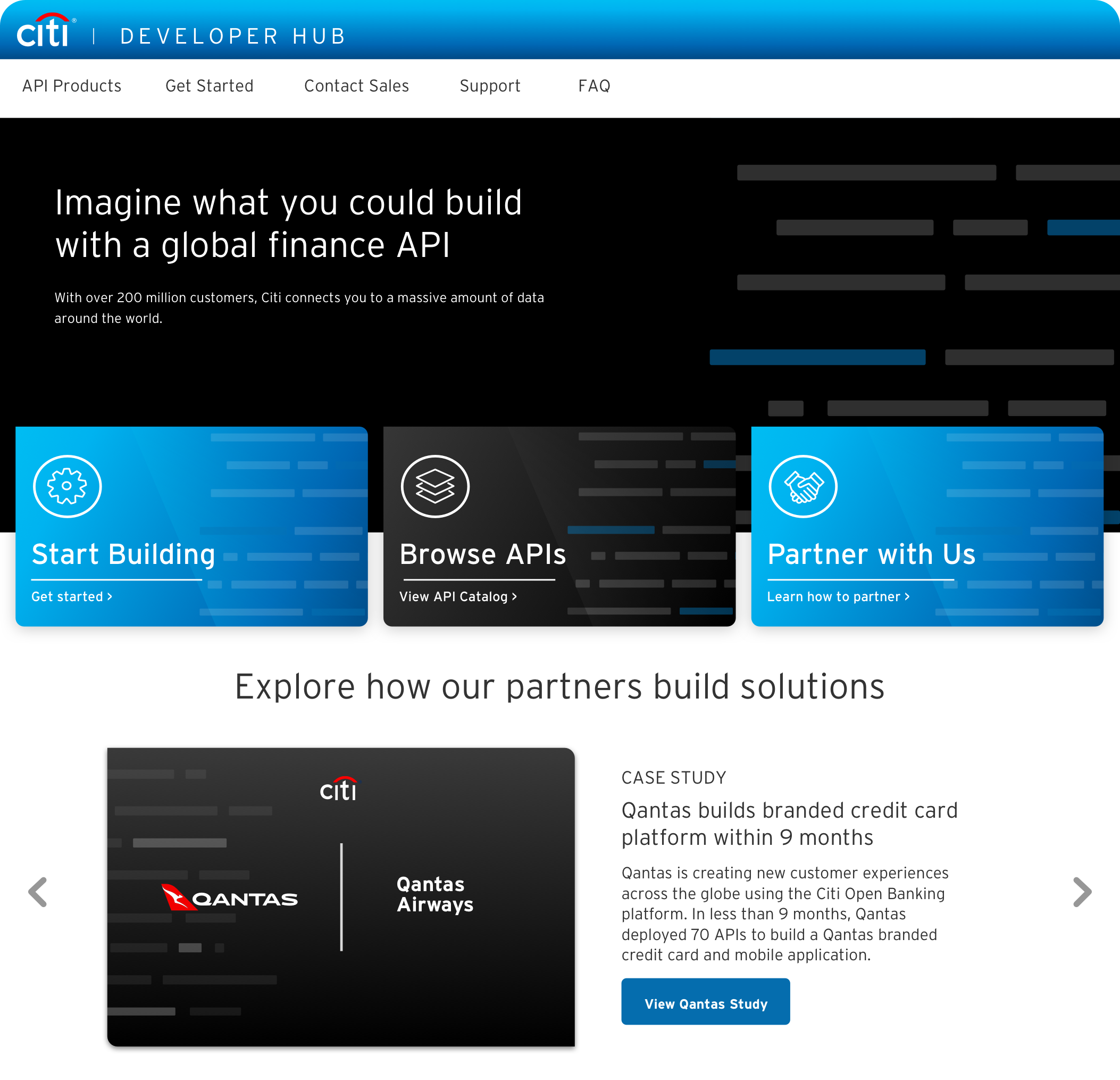
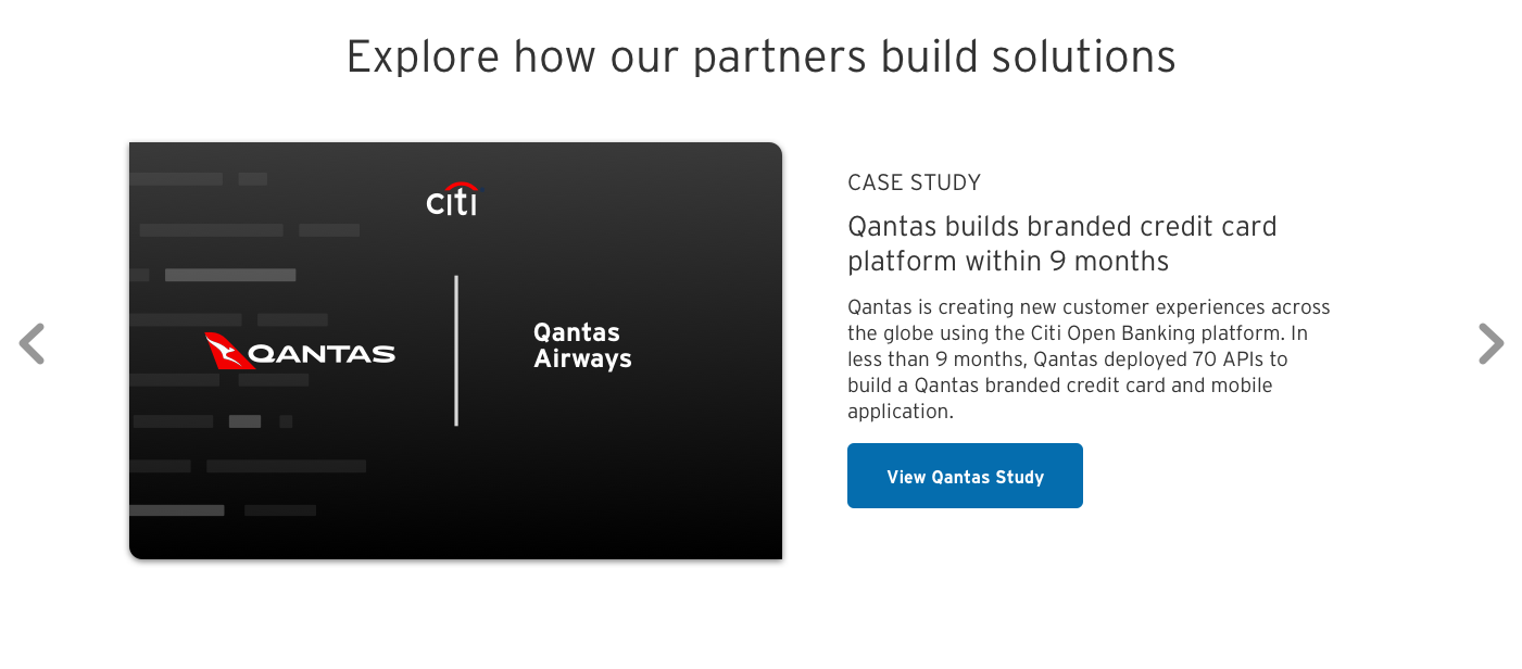
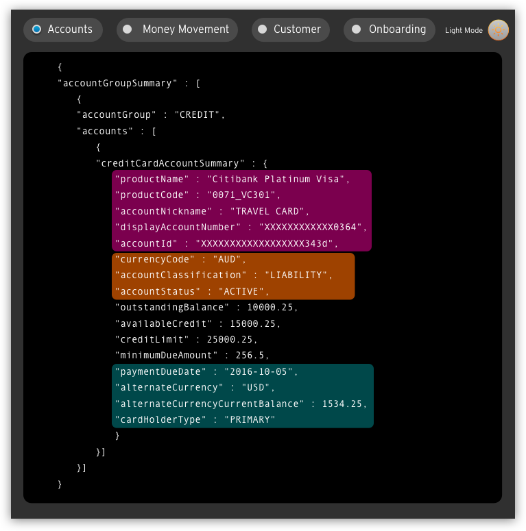
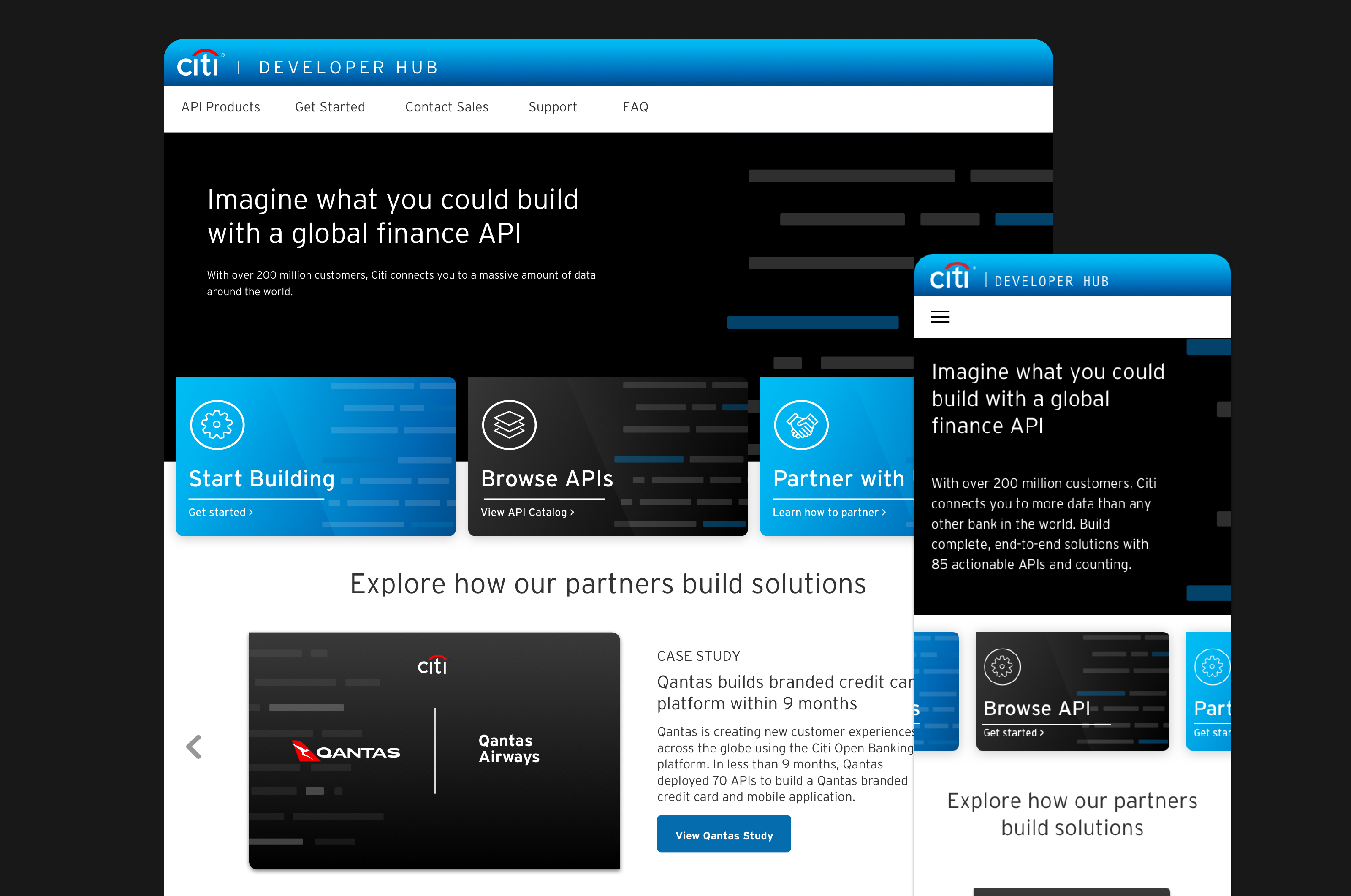
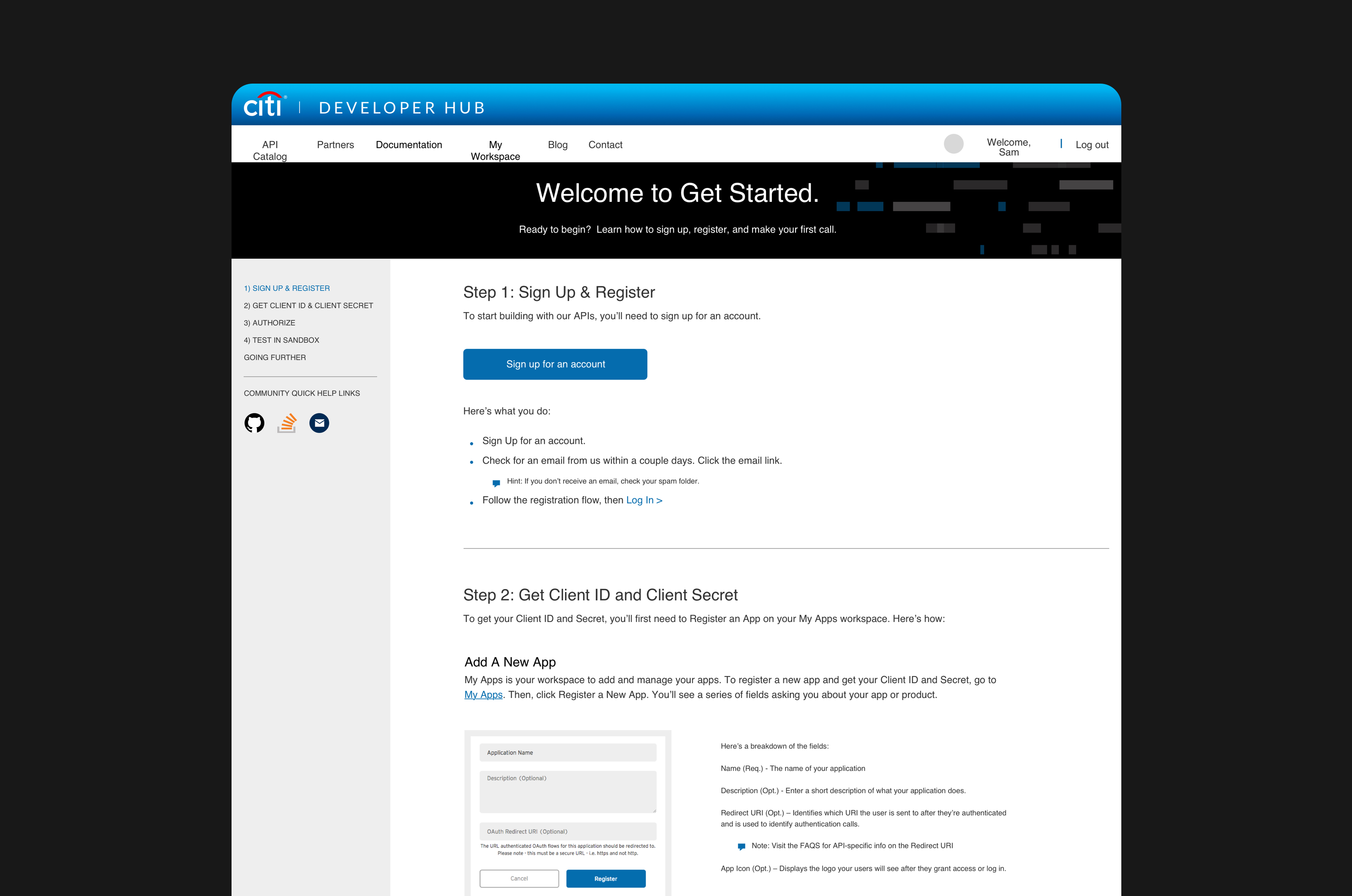
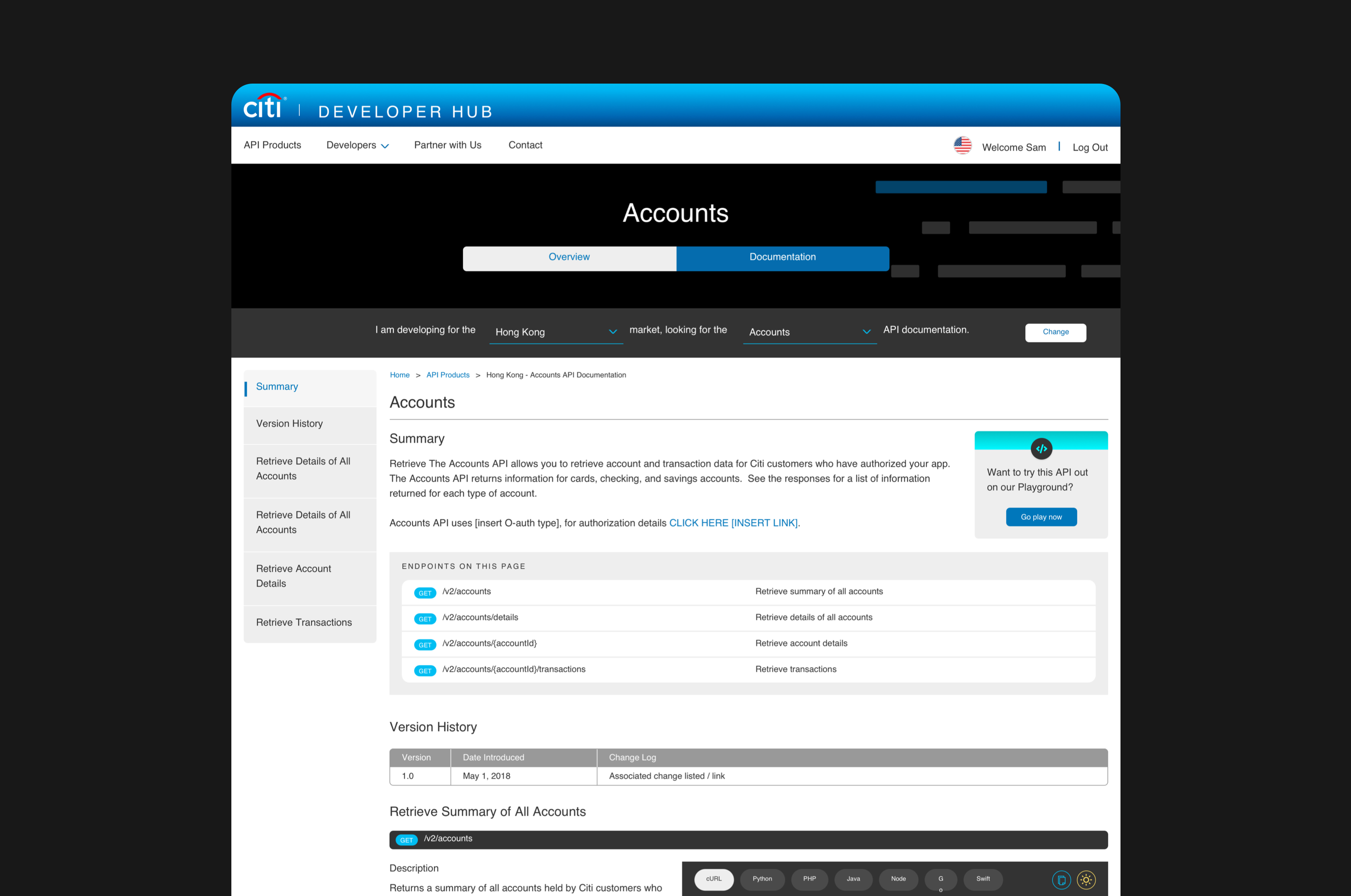
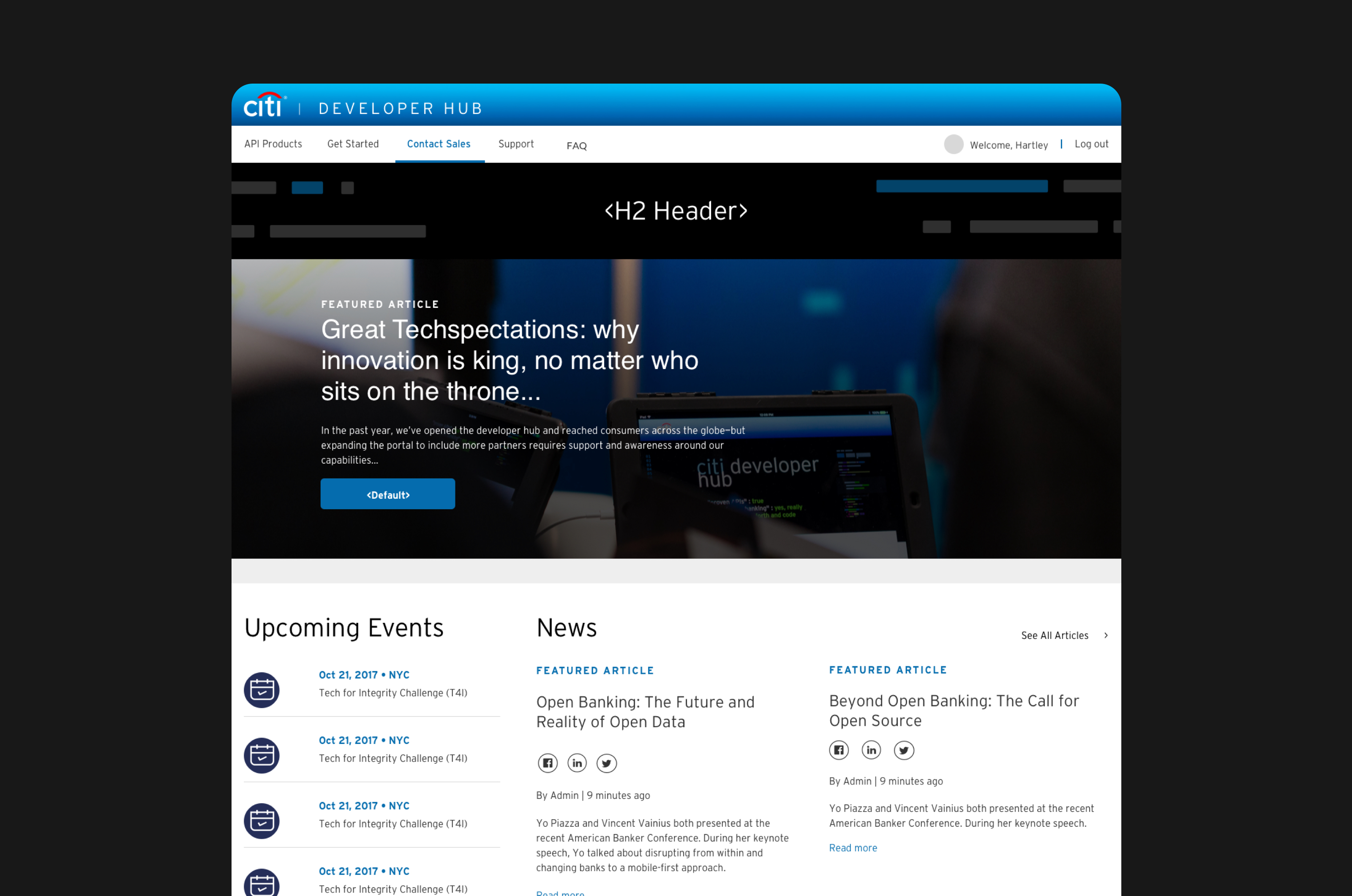
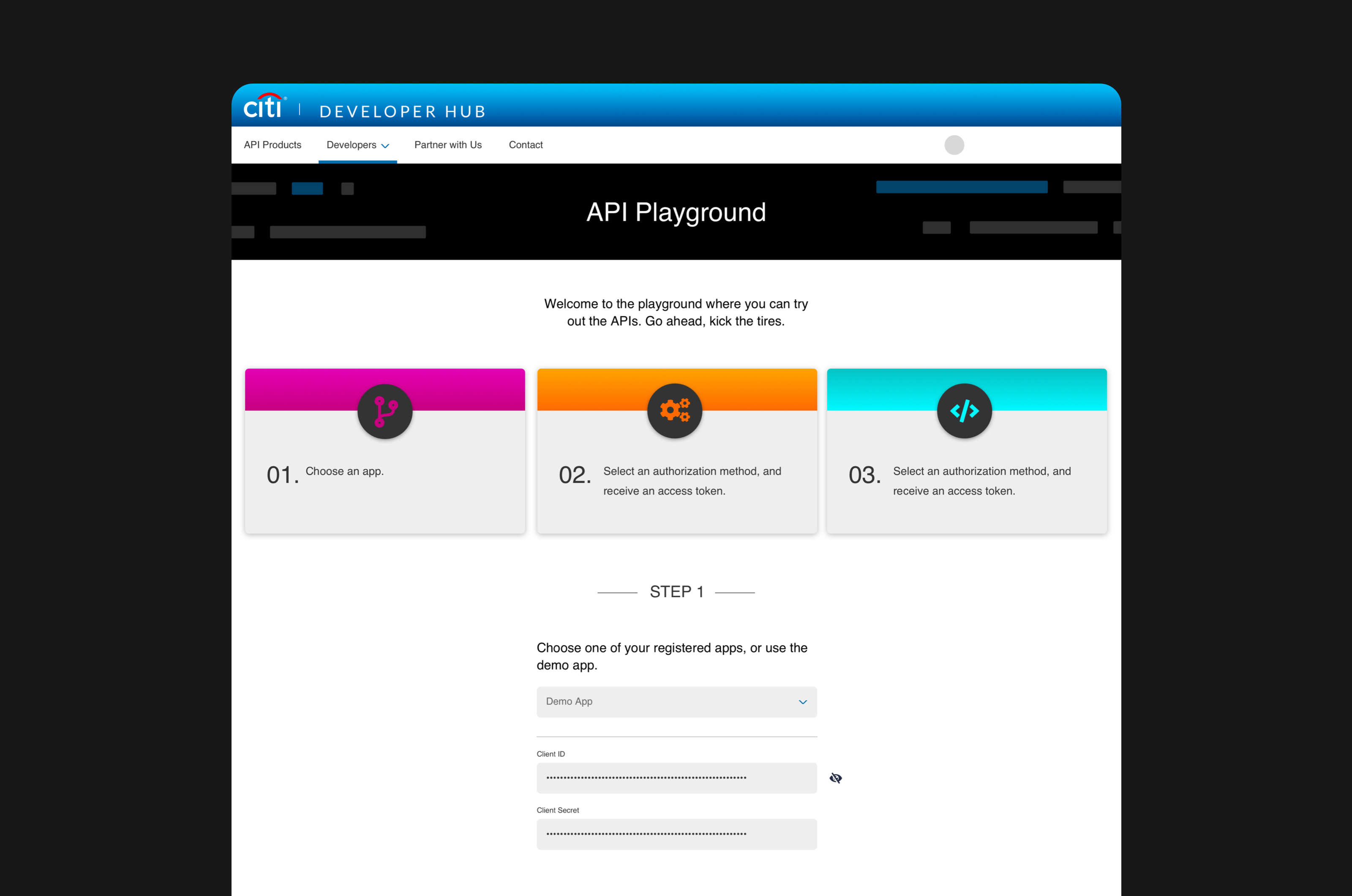
When initiating the high fidelity designs, the goal was to create a set of reusable components which featured an editorial and modern design aesthetic while maintaining a strong brand presence within Citi’s product portfolio.
Key Metrics
514 Citi customers TESTED via Cspace
49%
Are at least
somewhat interested
29%
Are uninterested
70%
At least are potential customers
Share on

